My Contribution
• I conducted in-depth secondary research
• I wrote interview and survey questions and conducted two interviews with users
• I wrote our entire protocol for usability testing and facilitated testing
Project Overview
The Challenge
We had to understand the needs of the contemporary grocery shopper and channel this knowledge to inform the design of a refined grocery shopping experience for the user. The design must maximize positive and fluid patterns of interaction.
Our Problem Statement
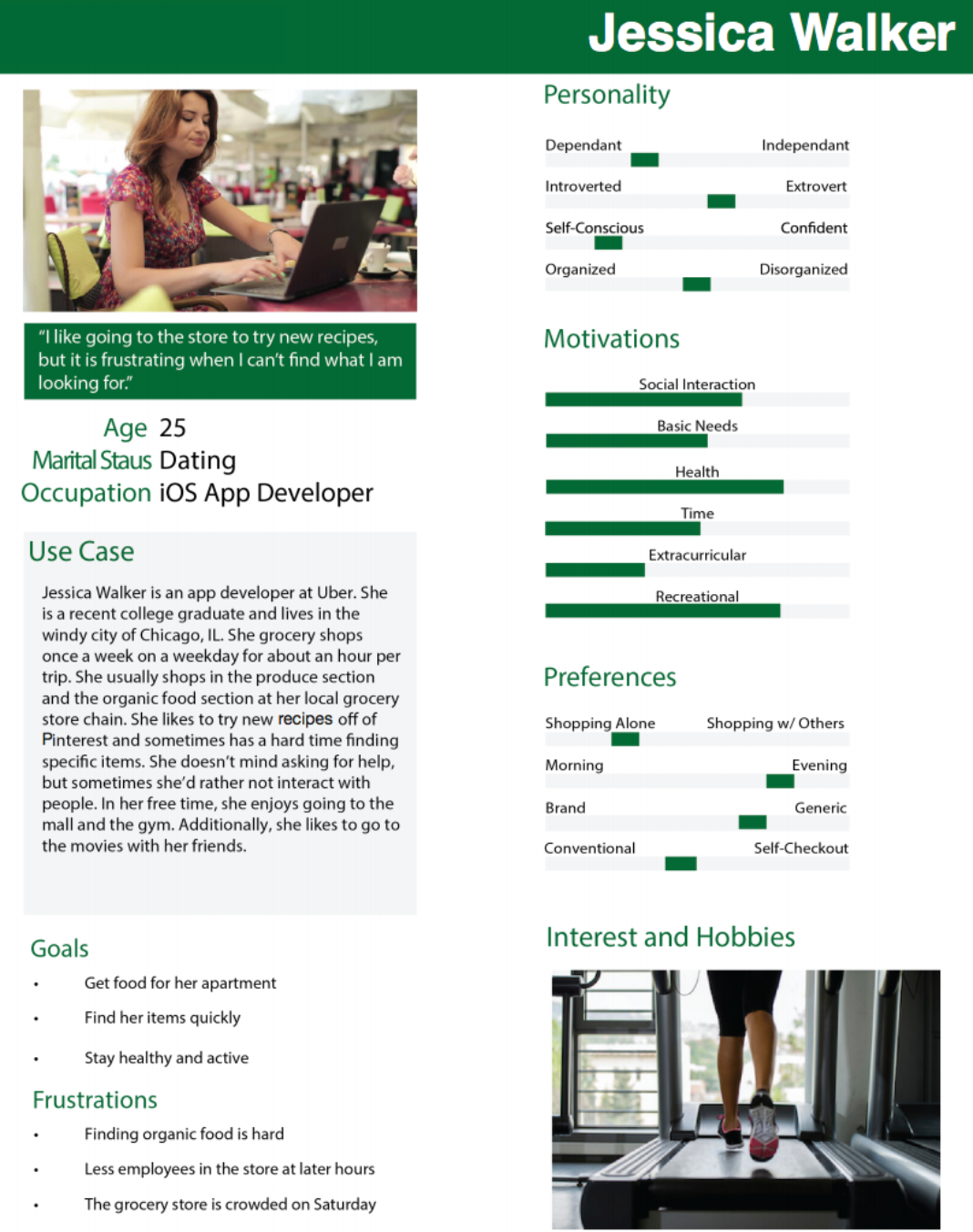
Women (aged 35-50) in smaller, urban grocery stores need to be able to quickly and efficiently find specialty or obscure items without having to seek out an employee for help.
Observations
Our team started out by conducting an observation session at our small, local grocery store: Fresh City Market. We made observations such as the habits of different demographics, the placement of items, the signage of the store, and the locations and tasks of the employees.
Interviews
Then we interviewed four frequent grocery store shoppers.
Goals
• Understand users’ shopping habits and opinions
• Identify pain points users have while shopping
Findings
• Shoppers sometimes have difficulty navigating through the store’s layout to find the specific items they need, especially when it comes to a specialty or obscure item, such as a non-staple item or something for a dietary need
• Shoppers do not want to have to seek out and ask employees for help because it requires more time and more social interaction than the customer would like
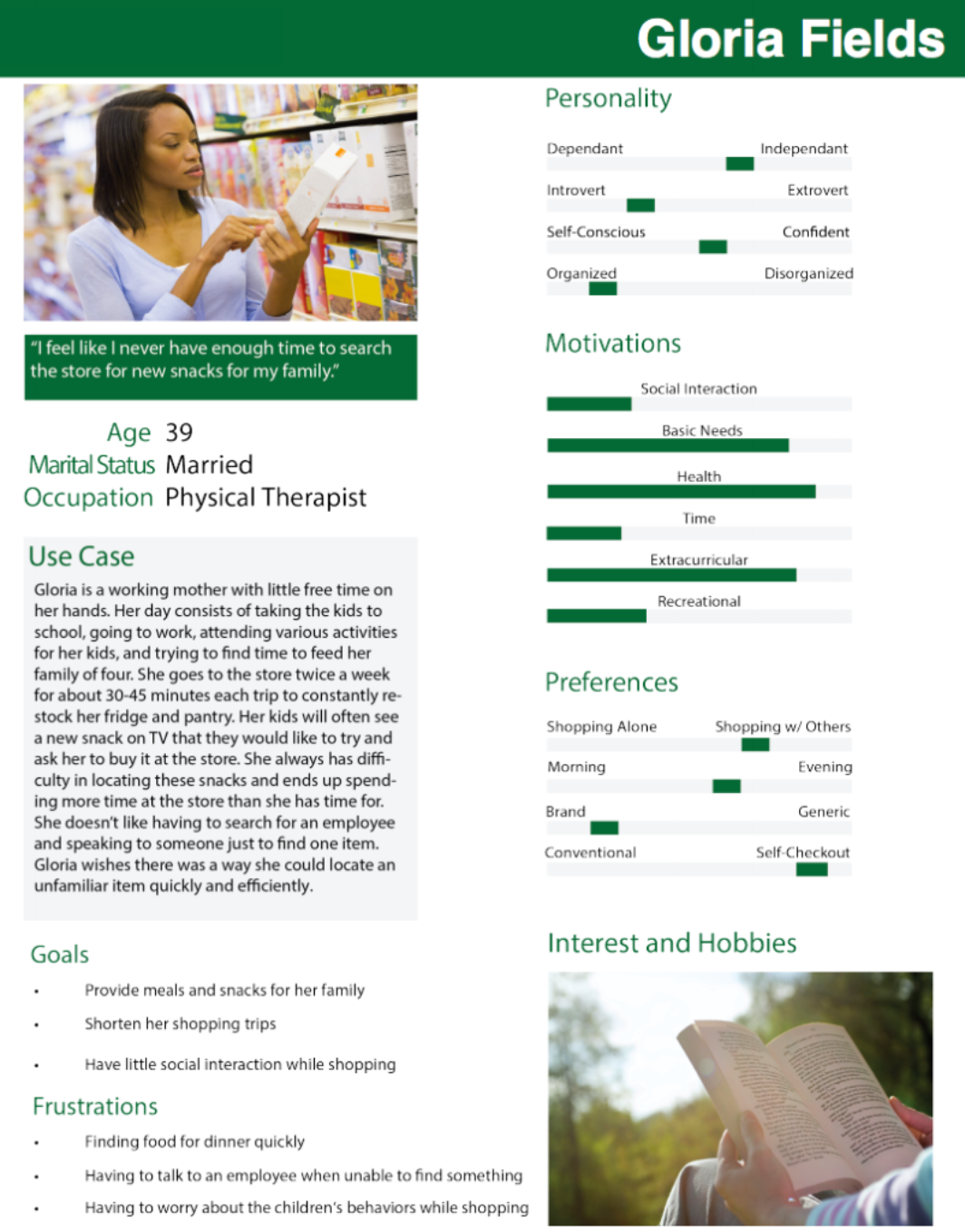
This lead us to help develop our problem of finding specialty or obscure items without having to seek out an employee. We also sent out surveys to get a better understanding of our demographics and their needs. Most of our respondents were females within the 35-50 age range shopping for families of four.
Secondary Research
We then did some secondary research to find more statistics about our problem.
Goals
• Find demographics on the “average” shopper and their habits
• Look at how technology has been used in the grocery store experience recently
Findings
• A majority of shoppers are female and the average shopper age is 47
• Helpful sale assistants make for a better customer experience, and people usually ask questions when they can’t find an item
• People like self-service kiosks because they are more convenient
• Users want technological assistants that are more human-like and conversational
These findings helped us develop our personas, as well as give us ideations for our prototype.
Personas
Initial Paper Prototype
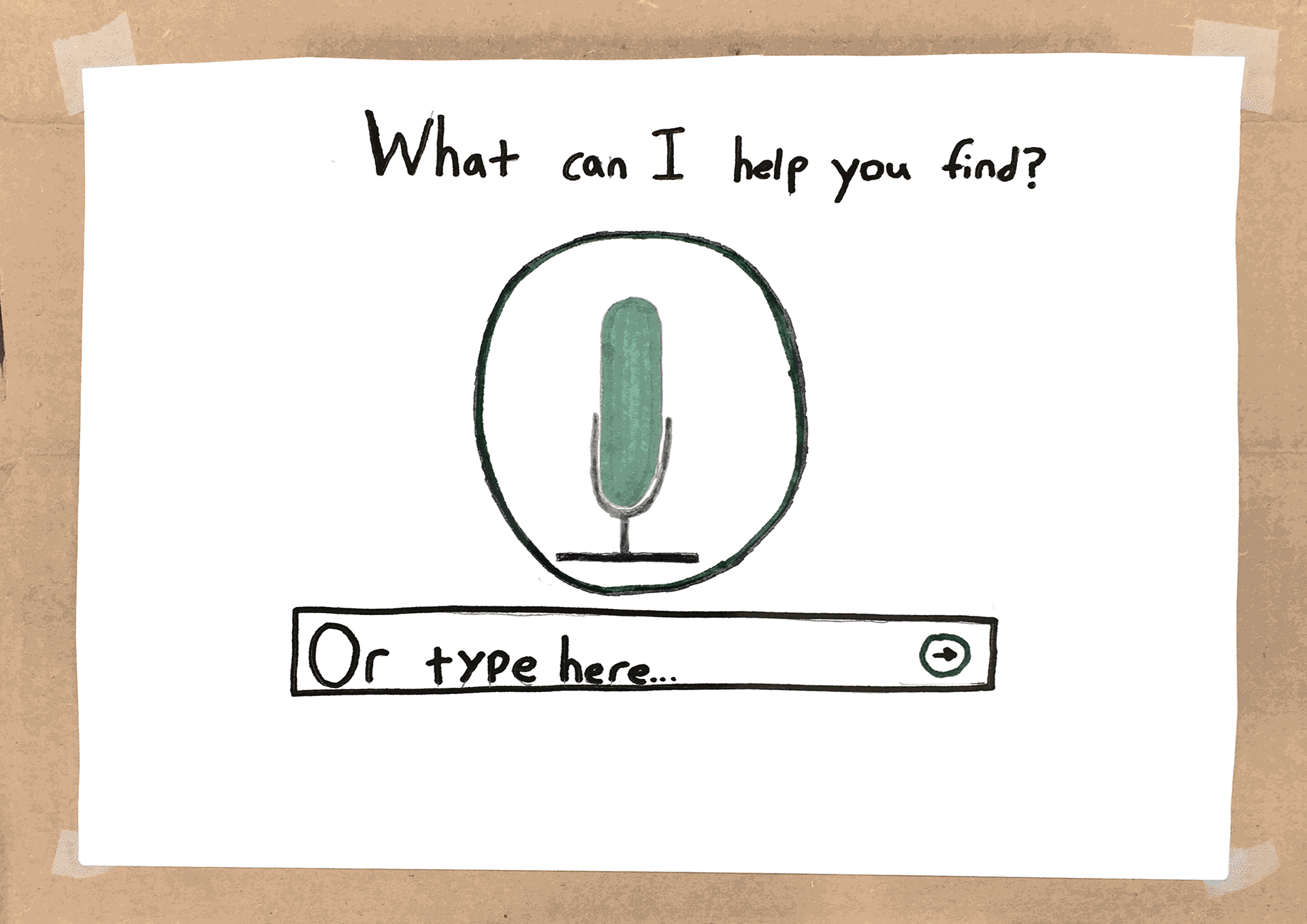

Shown above is our initial prototype. We developed a kiosk that would be placed throughout areas of the store.
The first screen shown is the initial landing page where the user can search for the item they are looking for. The question at the top indicates that the assistant is there to help the shopper find something in the store. We used the microphone button to indicate the user to speak into the assistant and ask a question. We took into account that not everybody would feel comfortable or be able to speak into the assistant, so we provided a typing option and a pop-up keyboard for those who would rather ask a question this way.
The second screen is the listening page. This page is presented to the user if the user chooses to speak their search option. This page is set in place to reassure the user that the software is listening and registering their words.
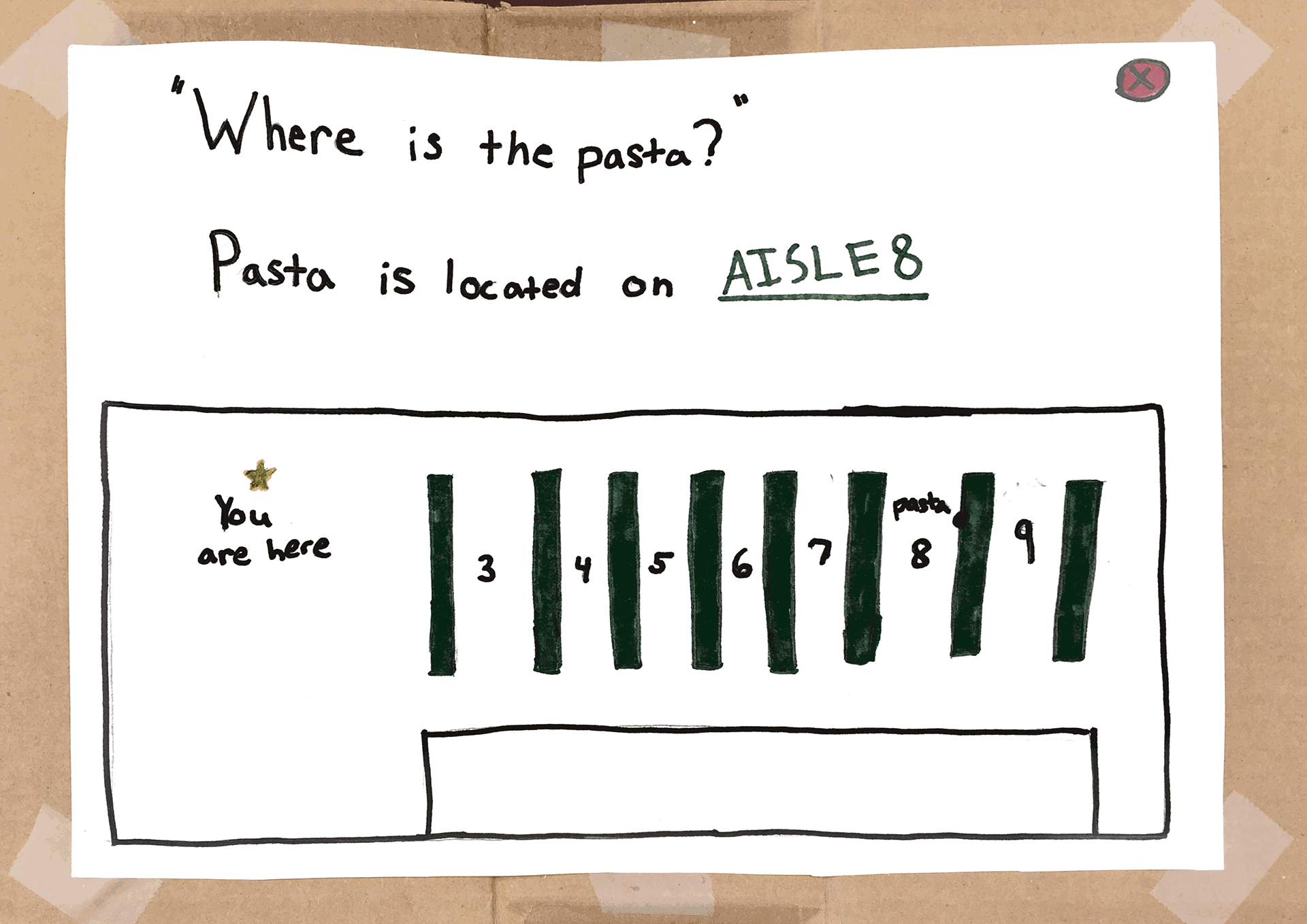
The final screen is the results page. This is the page that gives the user the results of where the item they asked for is located. At the top in quotations, the question that the user asked is shown to verify what the assistant heard . Underneath the quotation, the assistant provides the best answer, indicating which aisle the product is on. This sentence would be voiced as an answer by the assistant to sound conversational. This would be a women’s voice because in research we found, a speech application developer and voice user interface designer at the IVR Design Group stated that “people are more likely to respond a voice that closely matches their own personality, meaning they would sooner interact with an automated system that sounds similar to themselves in terms of gender, age, accent, level of education, income, and other factors.” Since the user group we decided to focus on was women, ages 35-50, we want to make the voice of our assistant a middle-aged woman.
Below this answer, we provided a map for the user, to understand where they are in the store in relation to where their product is in the aisle. This gives the user an efficient visual of where to find their product so they can effectively locate it in the aisle. In the top, right-hand corner, we provided a red exit button, signifying the user to press it when their experience is over. If the user does not press it, the system will time out after about a minute and restart to the initial page.
Usability Testing
Process
We had three users test our initial prototype. We had a detailed protocol that we read to each user with a specific scenario for our users to understand why they would be using the kiosk, and we had them explain in detail what they thought about each page, what they understood, and what they did not understand. I went through the protocol with each user while my teammates took notes and recorded observations.
Results
Overall, our grocery store virtual assistant tested well among users. All of our users enjoyed their experience with the assistant and claimed that they would use it in a grocery store. They enjoyed the simplicity of the design and how straight-forward it was. They claimed they didn’t find anything confusing, however, some of the tasks and signifiers weren’t understood to their original intents. We received some interesting suggestions on what else we could include in our designs, and discussed amongst ourselves if these suggestions would be beneficial towards our problem or would address a different problem.
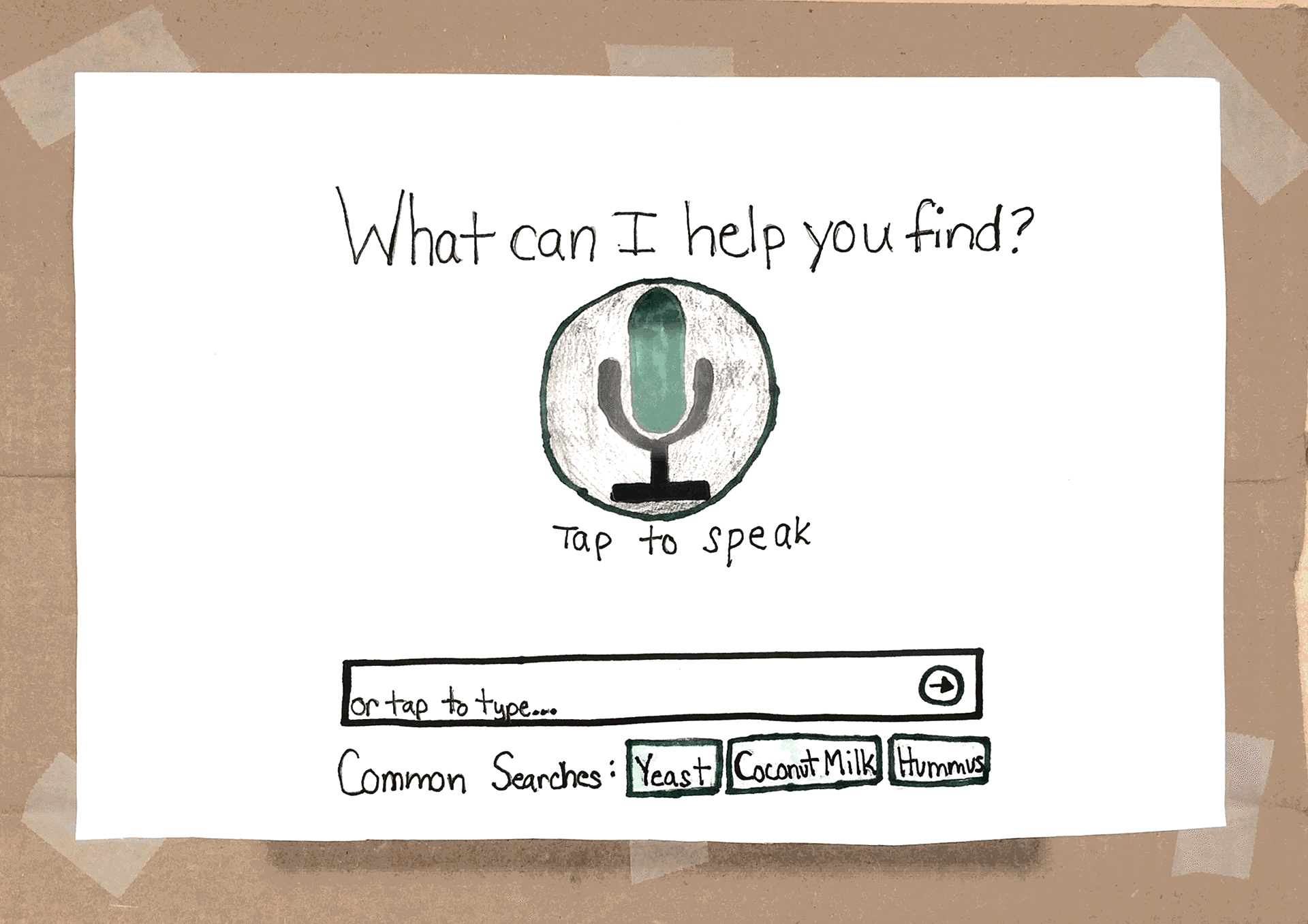
Two out of three of our users understood the purpose of the microphone, while one ignored it and went straight to typing without recognizing it. To indicate that the user should press the microphone and speak to the system, we decided to add the phrase “tap to speak” beneath the microphone icon to our updated prototype.
One user also suggested the addition of popular search suggestions for the user to be able to tap on if they are looking for the same item, rather than speaking or typing their question. We decided that this would improve efficiency with our design and incorporated it into our updated prototype.
There was nothing confusing about our listening page to our users, so we decided to keep it as is.
For our results page, one of our users thought he was able to click on “Aisle 8” to see more. We decided that to prevent this from happening, we would eliminate the green, underlined text, and instead bold the term to make it seem less clickable. One user also suggested the addition of a pathway from the current location to the location of the pasta that he can take. We decided to include this suggestion because it could better improve the user’s navigation and know the most efficient path for where to get their product.
Updated Paper Prototype

Desirability Testing
We decided to use desirability testing on our updated prototype. We felt desirability testing would be best for a grocery shopping technology implementation, because what makes grocery shopping enjoyable is customer experience. Therefore, we wanted to see how testers would react to our product, through using simple adjectives. These adjectives ranged from positive to negative words.
Process
We conducted two desirability tests on our updated prototype. A regular usability test was conducted. Then, our testers were asked to select three adjectives that best described their overall experience. The first user chose the adjectives “simplistic,” “clean,” and “accessible.” The second user chose the adjectives “straight-forward,” “time saving,” and “useful.”
Results
In both of our tests, our users were fully able to complete every task. Additionally they both chose only positive adjectives. The chosen words let us know that the product would be very useful in a grocery store context. Additionally, the tests ensured that our solution is quick and time efficient. Additionally, user 2 reassured us that she would use the device to find more obscure items.
Conclusion
Our solution “Sophie” is a grocery store virtual assistant that allows you to ask where any item is located in the store. After asking the question, the device will show you the aisle and map you a path from your current location the item. This allows you to avoid the trouble of locating and asking store employees.