My Contribution
• I lead planning and synthesizing all of the generative and evaluative research
• I conducted a comparative analysis
• I helped with ideation and design feedback based on secondary and primary research
Project Overview
Blue Radar Search is local start-up in Indiana with a website that promotes job searching and networking, aimed toward collegiate coaches. Their problem was that users are registering for an online account, but not filling out complete profiles. The goal of this project was to reduce drop offs between account registration and profile completion through user research, UX design, and a coded version of the redesign.
Problem Statements and Research Question
User-focused problem statement
Blue Radar Search users are not completing their profiles which prevents them from yielding the full benefits of networking and job opportunities.
Business-focused problem statement
Blue Radar Search has non-optimal profits on their Radar Scan feature because users are not completing their profiles after registering. (Radar Scan is used for coaches to show up in searches).
Research question
What causes users to not set up their profiles completely?
Methods
Research methods
• Literature review in three categories: onboarding, gamification, and collegiate coaches. Reviewing this literature provided us a basis for designing profile completion experiences and to better understand our primary users.
• Comparative analysis to look at the design & flow of sign-up processes on other social networking websites.
• Task analysis to familiarize ourselves with the Blue Radar Search website and discover pain points and opportunities within the current profile completion flow.
• Contextual inquiry to learn more about our primary users and observe how they interact with the BRS website and how much of their profile they are completing.
• Evaluative testing of the redesigned profile completion flow.
Design and development methods
• Constant ideating and sketching of a redesigned profile completion flow based on research findings.
• Wireframing of what the general profile completion page should include and what the new flow should be.
• High-fidelity clickable prototyping using BRS's style guide that could be implemented on the site.
• Coded prototype in Angular based on the the high-fi prototype to conduct testing with.
Task Analysis
"A task analysis breaks down the constituent elements of a user's work flow, including actions and interactions, system response, and environmental context." - Universal Methods of Design by Bruce Hannington & Bella Martin
Process
For our task analysis, we identified 5 subtasks, or points of entry, in the profile completion flow. For each subtasks, we identified scenarios, which are the stories and motivations behind the subtasks.
Then we outlined the functionality of each subtask, which the flow and every step the user takes to complete the subtasks. We created tags and tagged each step in the functionality section that we wanted to refer back to. The tags were: Pain Point, Important, Friction, and Opportunity. Lastly, based on these tags and analysis, we identified improvements for the problems we found in each subtask.
This method helped us familiarize ourselves with the profile completion flow and begin ideation early in the process.
Full task analysis
Contextual Inquiry
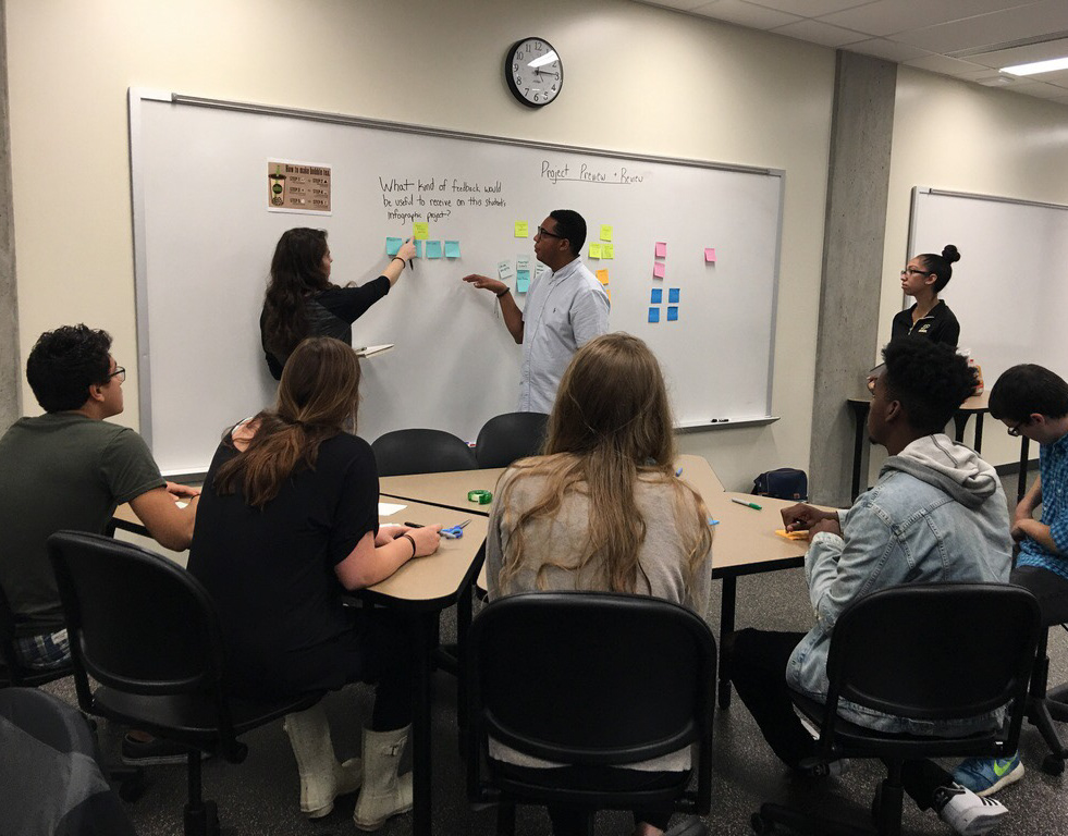
A contextual inquiry is a primary user-centered design research method that is set up similar to a semi-structured interview, but also includes observing the user interact with the product in their own environment while the researcher asks them questions throughout the session. We chose this method to not only learn more about our user group, but to see how they would interact with Blue Radar Search and how much of their profile they would complete in their own environment.
Process
Our sponsors at Blue Radar Search provided us 3 contacts they had with Purdue University collegiate coaches who were our target users and would be willing to participate in the research. Two participants are Women's Swimming and Diving coaches and one participant is a Men's wrestling coach. Two of the participants identified as female and one identified as male. Their ages were 26, 30, and 51.
At the beginning of the contextual inquiry sessions, we asked generative questions regarding their coaching experience, how they currently meet and network with other coaches, and their social media and technology habits. After the interview portion, we had them pull up the Blue Radar Search website and provided a hypothetical scenario to help prompt them to create an account. We observed how much of their profile they completed upon creating an account, and then asked follow-up questions on why they did and didn't fill out certain parts of their profile.
Takeaways
We identified a few main general insights, and several findings and pain points related to the experience of the profile completion flow and certain categories.
Main insights
1. Coaches satisfied with their current job do not see much benefit in completing their profiles, unless they were actively searching for a new job. They would come back to the website and complete their profile whenever they begin looking for a new job.
"It depends, too, where you're at in terms of your career. Like, if I was kind of looking for a job... I might add a bunch of work experience." - Women's Swimming and Diving Assistant Coach
2. Coaches interpret that the only purpose of the website is job hunting. If the website had other features that focused more towards connecting and networking, there might be more of an incentive to fill out their profile.
"Right now this isn't super important to me just because, obviously I got a job here. But if I was looking to apply to other places, then it's more important... Right now, it doesn't serve too much of a purpose." - Wrestling Assistant Coach
3. All 3 coaches began filling out (or attempted to fill out) their Coaching Tree. They found it cool and different than what they've seen on any other website. Showing off your connections seems to be important in the coaching world since it is small, and it can say, to some degree, what your coaching style is based on who you've worked with.
4. All 3 coaches did not have much interest in filling out Specializations. For example, in the swimming world, you want to be more versatile and not just focus on coaching one type of stroke or length. Coaches may not see the purpose or benefit of filling out their Specializations, or event understand what can fall under "specializations."
5. Coaches thought that the website might be more attractive and useful for young coaches early in their careers who are trying to find a new job and form connections. Thus, Blue Radar Search could market more towards younger coaches, or add more features for older, established coaches to use.
Our Redesign
Home screen
Original and our redesigned homepage
Above is a side-by-side comparison of the original home screen and our redesign. The first difference in our redesign is that we moved the sign-in forms directly to the top navigation bar of the website. We noticed in our comparative analysis that websites such as Facebook and LinkedIn were doing similar functions.
The next redesign we made to the home screen was to bring the sign-up modal directly to the home screen. We did this because, in our contextual inquiry, new users had a hard time finding the sign-up button in the top right corner. Also, we saw this pattern in our comparative analysis on websites like Handshake.
Profile completion screens
Next, we moved into working on our profile completion flow screens. In the images below, on the left is how the website currently looks, and on the right is our redesign. We created a template that every page in the onboarding flow would follow.
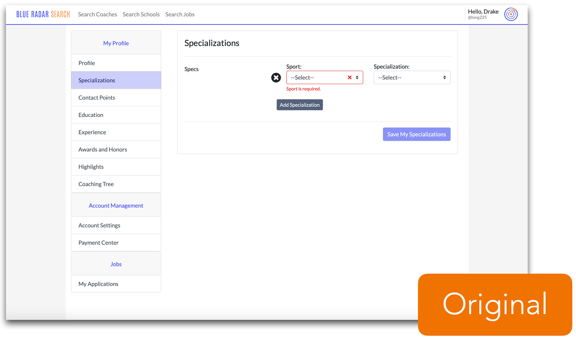
Original profile completion page
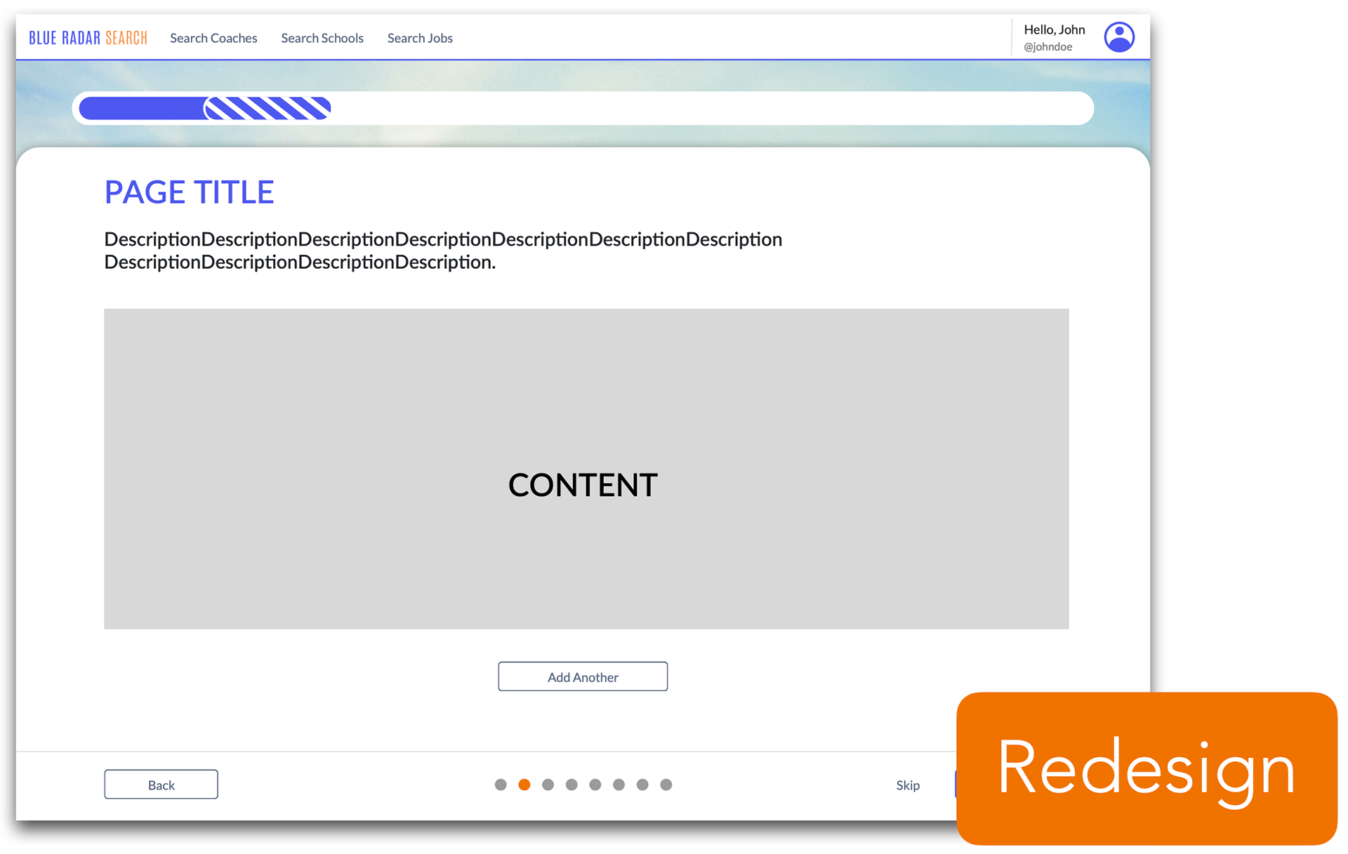
Our redesigned profile completion template page
Our redesign template includes 9 parts to the UX and information architecture of completing a profile: a progress bar, page title, directions/descriptions, content area for the user to make their profile selections, an action button to add another piece of information in that area, a back button, a skip button, a next button, and a secondary progress indicator to indicate to users exactly how many steps they are into the process and the ability to jump back & forth to certain pages. Much of this redesigned template was inspired from our comparative analysis and literature review.
We used this template to design every necessary piece of information needed to complete a profile. This includes pages for Specializations, Experience, Education, your Coaching Tree (adding others to your network), Awards & Honors, Highlight Reel, and Contact Information.
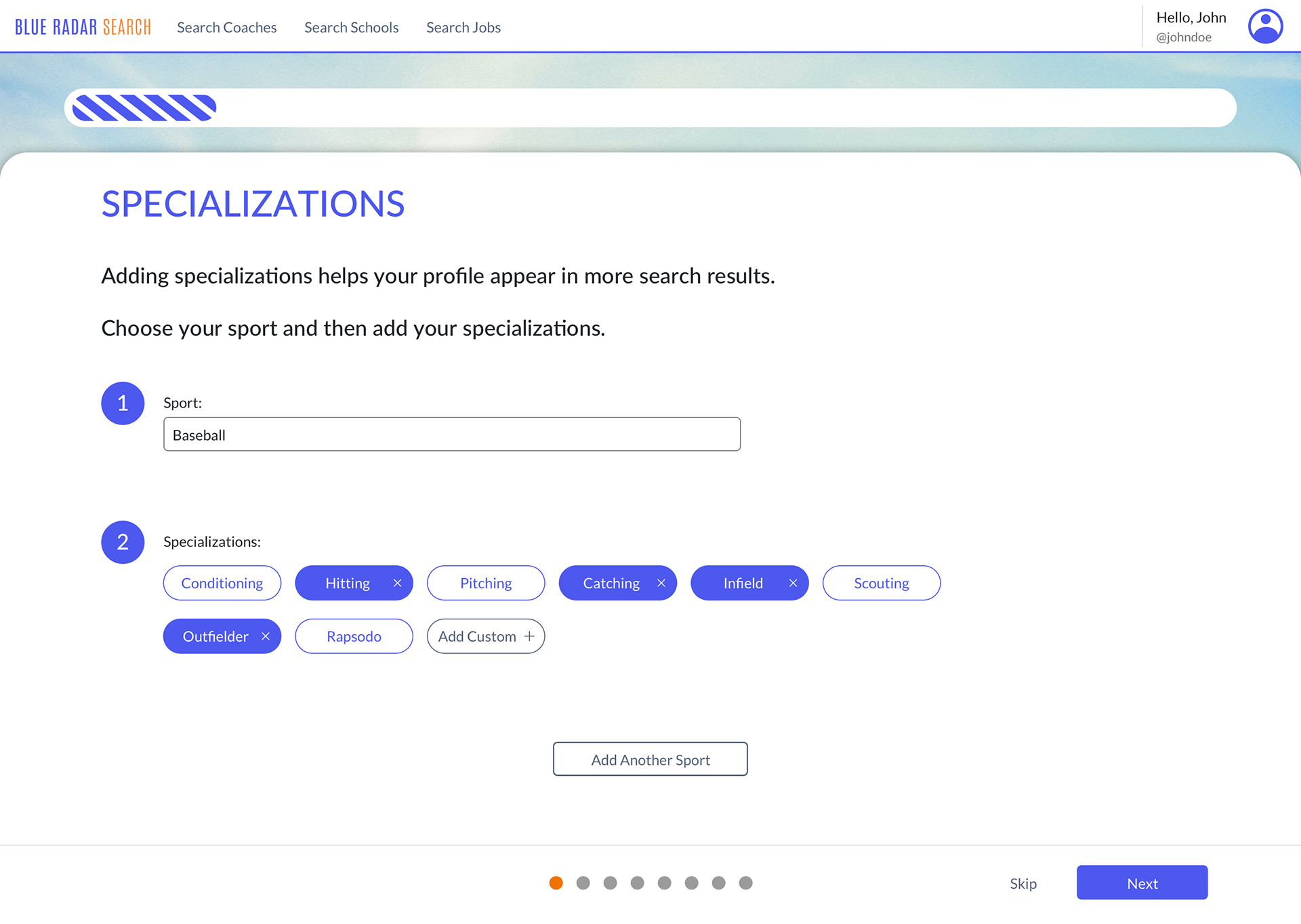
Specializations page
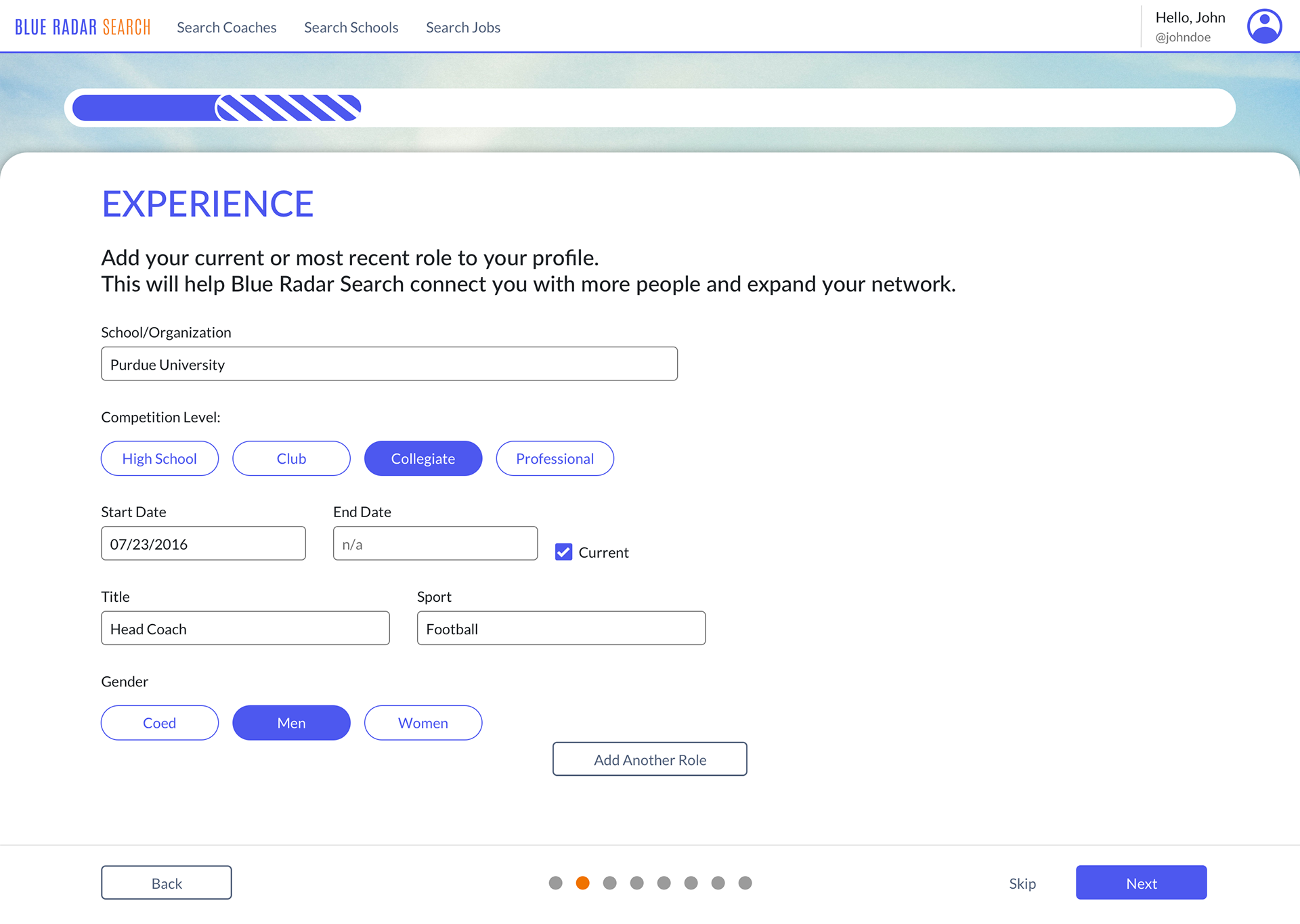
Experience page
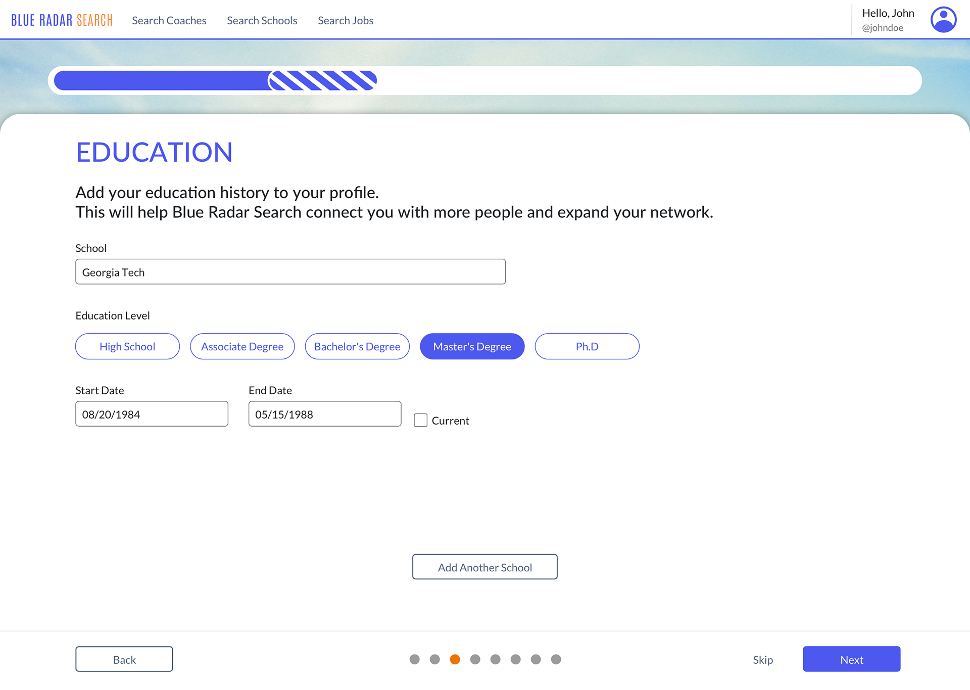
Education page
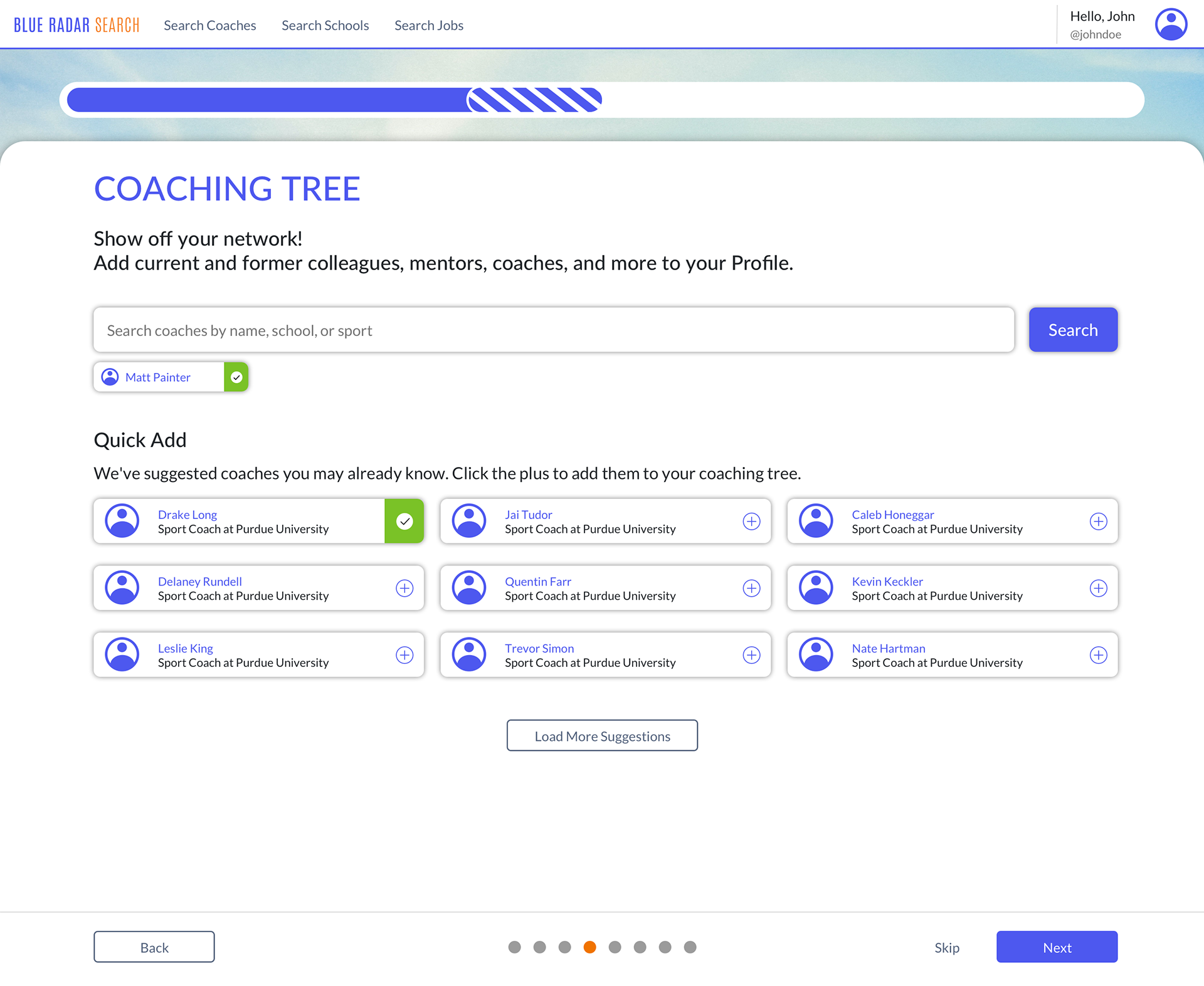
Coaching tree (your network) page
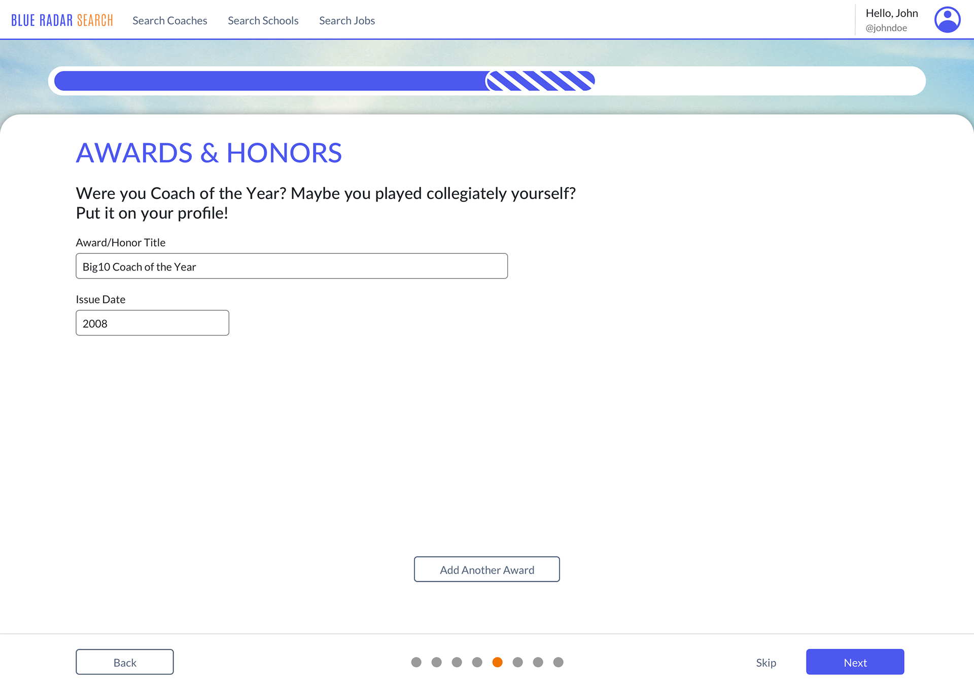
Awards and honors page

Contact information page
Profile Preview page
When a user is finished going through the profile completion flow, they are shown a preview of their completed profile with the information they have provided before publishing it to the website. Also on this page, users can upload a profile photo, add a cover photo, and add a personal biography.
Profile Preview page
Profile strength levels
Evaluation research
The goal of our evaluation research was to evaluate if users complete more of their profile with our redesign. The metrics we wanted to evaluate were percentage of profile completed with the redesign, time completion, usability and development errors, and any qualitative user feedback. We decided for our evaluation method to conduct in-person usability testing with our target audience so we could observe their interactions with the redesign and gain their personal feedback.
Process
We conducted 4 total sessions with collegiate coaches. The first 2 sessions we tested a clickable prototype redesign made in Sketch & InVision with the previous 2 Purdue Swimming & Diving coaches we spoke with for our contextual inquiry. For these sessions, we were more concerned with finding any usability issues and gaining qualitative feedback. Overall, the coaches really liked the redesign of the profile completion flow and found it much faster and more straightforward. There were a few things that they found confusing or mentioned could be improved upon, with the main ones being the Coaching Tree page and the profile preview page. We this feedback, we made design changes to these two pages before they were coded.
Results
The final 2 sessions we tested our coded redesign with 2 Purdue Volleyball coaches, where they were able to input their own information. For these sessions, we looked at the percentage of how much of their profile they completed, and the session time it took. The first coach completed 86% of his profile (6 out of 7 sections) and it took him 5 minutes and 27 seconds. The second coach completed 71% of her profile (5 out of 7 sections) and it took her 4 minutes and 35 seconds. However, it's important to note that there was some discussion during the session, so this prolonged the amount of time completion took. Both coaches were confused by the Highlight Reel section, but once understood, said they didn't have a video to put in that section anyways.
We also found some usability and development errors that we made minor changes on:
• Added more description on what could be included in "Highlight Reel"
• Switched the order of Education and Experience
• Changed the input of starting and end dates to just month/year (not including the exact date)
• Made the page directions more profound to encourage readability
• Improved the dev functionality of the progress bar, and the "Add Another" and "Skip" buttons
Overall, the qualitative feedback was very positive:
"Doesn't feel as redundant as other sign-up processes."
"Easy, simple, and pretty self-explanatory."
"Coaching Tree made me excited to finish my profile."
Suggested Future Features
While we completed our goal of redesigning and improving the profile completion flow, our research uncovered some insights and ideas of features in other parts of the Blue Radar Search website we believe would not only encourage users to complete more of their profile, but also improve the overall user experience and get users to be more active in networking and job hunting through the website.
1. Homepage dashboard. Includes:
• Items still needing completion on profile
• Jobs you may be interested in
• Coaches you may know
• Ability to make status updates, share coaching achievements, or share articles, images, or videos
2. Features to enhance Coaching Tree. Includes:
• Button to add coach to your Coaching Tree while on their profile
• More visualization of your Coaching Tree on your profile to show connections between people
3. Ability to message other coaches to encourage networking
4. Feature to help younger coaches find mentors
